class: center, middle, inverse, title-slide # Data for farming ## Introduction to R<br>for data science ### Benjamin Nowak ### November 2021 --- background-image: url(fig/back/barley.jpg) background-size: cover class: center, bottom, inverse # <span style='font-size:55px'> **Program** </span> ### Data analysis and visualization with the **{tidyverse}** --- # Getting started 1. [Download R](https://cran.r-project.org/) on CRAN > *"The “Comprehensive R Archive Network” (CRAN) is a collection of sites which carry identical material, consisting of the R distribution(s), the contributed extensions, documentation for R, and binaries."* 2. [Download R Studio](https://www.rstudio.com/products/rstudio/download/#download) > *"RStudio is an integrated development environment (IDE) for R. It includes a console, syntax-highlighting editor that supports direct code execution, as well as tools for plotting, history, debugging and workspace management."* - Choose 'Free RStudio Desktop' to run RStudio on your local machine --- # Getting started - Once RStudio is installed, we are ready to create a new **Project** - *File > New Project > New Directory* .center[ <img src="fig/R/projects_new.png" width=50%></img> ] - Doing so, the **current working directory** is set to the **project directory** (where we can for example store the data sets related to this project in a **'Data'** folder) --- # Getting started .center[ <img src="fig/R/Rproj.png" width=50%></img> ] .footnote[ **Source:** [Musings on R (Martin Chan)](https://martinctc.github.io/blog/rstudio-projects-and-working-directories-a-beginner's-guide/) ] --- # Getting started - We can create **a new script** inside this project - *File > New File > R Script* - Although RStudio keeps track of the changes made to the script, we will save it before we start - *File > Save as* - You may save it in a **'Script'** folder, as suggested in the previous slide <br> -- .center[<span style='font-size:30px; color:#2a9d8f;'>**We are now ready to process data!**</span>] --- background-image: url(fig/back/wheat.jpg) background-size: cover class: center, bottom, inverse # <span style='font-size:55px'> **First example** </span> ### World evolution of cereal yields and nitrogen use efficiency --- # Load packages - **The [{tidyverse}](https://www.tidyverse.org/):** Collection of R packages for data science. All packages share an underlying design philosophy, grammar, and data structures.  .footnote[ **Source** [Barnier, 2021](https://juba.github.io/tidyverse/index.html) ] --- # Load packages - **The [{tidyverse}](https://www.tidyverse.org/):** Collection of R packages for data science. All packages share an underlying design philosophy, grammar, and data structures. - First lines of code will be to install and load these extensions in our R session ```r # Install tidyverse (to do only once) # install.packages("tidyverse") # Load tidyverse (to repeat at each session) library(tidyverse) ``` --- # Import data - Data in this tutorial are related to **worlwide grain yields (since 1962)** and **nitrogen fertilizers consumption (since 2002)**. - Data set from [Our World in Data](https://ourworldindata.org/grapher/cereal-crop-yield-vs-fertilizer-application), which compiles data from various sources, including the large data base of the [Food and Agriculture Organization (FAO)](https://www.fao.org/statistics/en/). - It was previously used in [TidyTuesday](https://github.com/rfordatascience/tidytuesday/blob/master/data/2020/2020-09-01/readme.md), a weekly data project aimed at the R ecosystem. - With the [{tidyverse}](https://www.tidyverse.org/), we may use [{readr}](https://readr.tidyverse.org/) to load data sets into our session - Compared to base functions, {readr} functions are much faster to import data sets, and include a progress bar for large data set that take a longer time to load --- # Import data - The data are available online, and can be loaded directly into R, without downloading - You may copy/paste [this link]('https://raw.githubusercontent.com/rfordatascience/tidytuesday/master/data/2020/2020-09-01/cereal_crop_yield_vs_fertilizer_application.csv') inside **read_csv()** to import the data ```r # Import data data <- readr::read_csv( 'https://raw.githubusercontent.com/rfordatascience/tidytuesday/master/data/2020/2020-09-01/cereal_crop_yield_vs_fertilizer_application.csv' ) # To take a look at 3 first lines # head(data,3) ``` --- # Data structure - This data table is already close to the 'tidy' syntax and will require little modification .center[ <img src="fig/R/tidydata_1.jpg" width=70%></img> ] .footnote[ **Picture** [Alison Horst](https://github.com/allisonhorst) ] --- # Data processing - Thanks to the pipe operator (**%>%**), we may perform a sequence of actions on the same data set. - Here, we will start with a single step to simplify some column names ```r # Modify data table data <- data%>% # Rename columns dplyr::rename( # New name = Old name Yield = 'Cereal yield (tonnes per hectare)', Nitrogen = 'Nitrogen fertilizer use (kilograms per hectare)' ) ``` --- # Data processing - Most of table modifications are supported by the [{dplyr}](https://dplyr.tidyverse.org/) package. For example: - Data sorting is done by the **filter()** function - You can add a new column with **mutate()**...etc... ```r # Create new 'world' table world <- data%>% # Select data for "World" only dplyr::filter(Entity=="World")%>% # Only year after 2001 # (no data on fertilizer use before) dplyr::filter(Year>2001)%>% # New column with nitrogen use efficiency for each year dplyr::mutate( Efficiency = Yield/Nitrogen )%>% # Remove rows with NA values drop_na() ``` --- # First plot - We are now ready to make our first plot with [{ggplot2}](https://ggplot2.tidyverse.org/) - **Basic structure of a ggplot:** ```r plot1 <- ggplot( # Specify data set data = data_set, # Specify x- and y- axis aes(x=variable1, y=variable2) )+ # Add new layer to plot with '+' geom_point( # May also use data/aes inside geom aes(color=variable3) ) ``` --- # First plot - Let's apply this structure to our data set .pull-left[ ```r p1 <- ggplot( data=world, aes(x=Nitrogen, y=Yield) )+ geom_point( # Inside aes(): # Color change for each point aes(color=Efficiency), # Outside aes(): # Same size for all points size=3 ) p1 ``` ] .pull-right[ <!-- --> ] --- # First plot - We can add **more than one layer** to our plot, like **geom_line()**... .pull-left[ ```r p1+ geom_line() ``` ] .pull-right[ 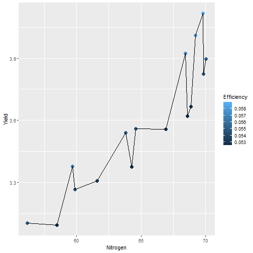<!-- --> ] --- # First plot - ... but best idea here would be to plot a regression line with **geom_smooth()** .pull-left[ ```r p1 <- p1+ geom_smooth( # Linear regression # (Default = loess) method='lm', # Hide confidence interval se=FALSE, # Color: color="royalblue" ) p1 ``` ] .pull-right[ 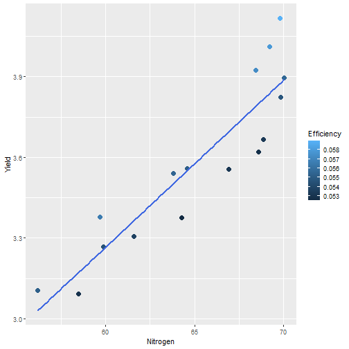<!-- --> ] --- # First plot - We may also add name of a few years with **geom_text()**. .pull-left[ ```r p1<-p1+ geom_text( # Filter data for # selected years data=world%>% filter( (Year==2002)|(Year==2017) ), aes( # +0.05 on y-axis # to avoid overlapse x=Nitrogen,y=Yield+0.05, # Set text labels label=Year), # Set text features # outside aes() size=5,fontface='bold' ) p1 ``` ] .pull-right[ 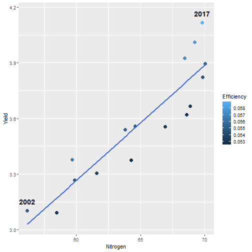<!-- --> ] --- # Plot customization - With [{ggplot2}](https://ggplot2.tidyverse.org/), plots are highly customizable. We will start by modifying the color gradient. .pull-left[ ```r p1<-p1+ scale_color_gradient( # Set colors using # hex notation low="#ff8989", high="#a9ff68" )+ guides( # Hide legend color='none' ) p1 ``` **Note:** [coolors.co](https://coolors.co/palettes/trending) is a great resource to pick colors ] .pull-right[ <!-- --> ] --- # Plot customization - We may also modifiy axis labels and add title, subtitle and captions .pull-left[ ```r p1<-p1+ labs( title='Nitrogen use efficiency (NUE)', subtitle='Increasing NUE from red to green', x='Nitrogen fertilizer (kg/ha)', y='Cereal yield (t/ha)', caption='Data: Our World in Data' ) p1 ``` ] .pull-right[ <!-- --> ] --- # Plot customization - All [theme elements](https://ggplot2.tidyverse.org/reference/theme.html) of a ggplot (title, axis, background...) may be individually modify but it's faster to use [predefined themes](https://rpubs.com/Mentors_Ubiqum/default_themes) first .pull-left[ ```r p1<-p1+ # Use predefined theme theme_light()+ # To change each element # individually theme( plot.title=element_text( size=25,color='grey20' )) p1 ``` ] .pull-right[ <!-- --> ] -- .center[ <span style='font-size:30px; color:#2a9d8f;'>**You may now customize more elements (subtitle, axis...)**</span> ] --- # Create custom theme - You may save theme modifications as a custom theme, that you can use on several plots ```r # Save custom theme custom_theme<-theme( plot.title=element_text(size=25,color='grey20',face='bold'), plot.subtitle=element_text(size=20,color='grey20'), axis.title=element_text(size=20,color='grey20'), axis.text=element_text(size=15,color='grey40'), plot.caption=element_text(size=15,color='grey40') ) # Apply custom theme to plot p1<-p1+ custom_theme ``` --- # Main conclusions - Before going further, what do we learn with this plot? .pull-left[ - Clear relationship between worldwide nitrogen fertilizer use and cereal yields - We use approximately **15 kg of nitrogen to produce 1 ton of cereals** - Nitrogen use **efficiency slightly increase in most recent years** ] .pull-right[ <!-- --> ] --- background-image: url(fig/back/rice.jpg) background-size: cover class: center, bottom, inverse # <span style='font-size:55px'> **Second example** </span> ### Difference in nitrogen use efficiency between countries --- # Countries selection - We will start this second example by making a selection of countries and filtering our data set with this selection ```r selection <- c( 'Australia','Brazil','China', 'France','India','United States' ) sub <- data%>% # Keep only data for selected countries # (use %in% to filter with a vector) filter(Entity %in% selection)%>% # Again, keep only years with data on fertilizers filter(Year>2001) ``` --- # Statistics for each country? - Let's say that we now want to compute basic statistics for each country. First, we will try to do that with **mutate()**. ```r sub%>% mutate(mean_yield=mean(Yield))%>% # Sort rows by year dplyr::arrange(Year)%>% # Keep only first 3 rows head(3) ``` ``` ## # A tibble: 3 x 6 ## Entity Code Year Yield Nitrogen mean_yield ## <chr> <chr> <dbl> <dbl> <dbl> <dbl> ## 1 Australia AUS 2002 2.20 40.7 4.71 ## 2 Brazil BRA 2002 2.84 34.8 4.71 ## 3 China CHN 2002 4.87 199. 4.71 ``` - But, doing so, we can only compute the mean yield **for the whole table** --- # Statistics for each country? - To calculate statistics for each country, we need to convert our table into a 'grouped' table with [**group_by()**](https://dplyr.tidyverse.org/reference/group_by.html) .pull-left[ <img src="fig/R/group_by_ungroup.png" width=100%></img> **Picture** [Alison Horst](https://github.com/allisonhorst) ] .pull-right[ - Look of the table will not change but the functions will be applied per group (not on the whole table) - After **group_by()**, two possibilities: add a new column with **mutate()** OR create a resume of the statistics with **summarize()** ] - Finally, use **ungroup()** to remove grouping. --- # Statistics for each country? ```r resume <- sub%>% drop_na()%>% # Remove rows with NA dplyr::group_by(Entity)%>% # Group by countries dplyr::summarize( mean_yield = mean(Yield), # Mean sd_yield = sd(Yield), # Standard deviation mean_nitro = mean(Nitrogen), sd_nitro = sd(Nitrogen) )%>% dplyr::ungroup() # Remove grouping resume ``` ``` ## # A tibble: 6 x 5 ## Entity mean_yield sd_yield mean_nitro sd_nitro ## <chr> <dbl> <dbl> <dbl> <dbl> ## 1 Australia 1.87 0.456 36.5 2.68 ## 2 Brazil 3.93 0.759 52.7 14.1 ## 3 China 5.53 0.377 230. 17.3 ## 4 France 7.03 0.536 112. 6.96 ## 5 India 2.69 0.286 88.5 14.1 ## 6 United States 6.95 0.883 70.6 4.70 ``` --- # Modifications based on a condition - Before drawing our second plot, we will change the name of *'United States'* to *'USA'*. To do so, we will use a combination of **mutate()** and [**case_when()**](https://dplyr.tidyverse.org/reference/case_when.html) .center[ <img src="fig/R/dplyr_case_when.png" width=70%></img> ] .footnote[ **Picture** [Alison Horst](https://github.com/allisonhorst) ] --- # Modifications based on a condition - You may also use **mutate()** to update an existing variable. In that case, we will modify country names stored in *'Entity'* ```r resume <- resume%>% mutate(Entity=case_when( # If Entity = 'United States', change to 'USA' Entity=='United States'~'USA', # Otherwise, keep old name TRUE~Entity )) ``` - **case_when()** can be used with multiple conditions, with variables of different types (factors, numeric, boolean...) which makes it an easy to use and powerful function --- # Second plot - We will use both tables (*sub* and *resume*) in our second plot. Let's start by plotting all (Nitrogen; Yield) points. .pull-left[ ```r p2<-ggplot( data=sub, aes( x=Nitrogen, y=Yield, color=Entity ))+ geom_point( size=3, # Add transparency alpha=0.5 )+ theme_light() p2 ``` ] .pull-right[ <!-- --> ] --- # Custom color palette - Before going further, we will create a custom color palette .pull-left[ ```r # Custom color palette pal <- c( 'Australia' = '#E9C46A', 'Brazil' = '#8AB17D', 'China' = '#E76F51', 'France' = '#2A9D8F', 'India' = '#F4A261', 'USA' = '#264653' ) # Apply to plot p2<-p2+ scale_color_manual( values=pal ) p2 ``` ] .pull-right[ <!-- --> ] --- # Add statistics per country - Add means to the plot .pull-left[ ```r p2<-p2+ geom_point( data=resume, # Different x and y # (but same color) aes( x=mean_nitro, y=mean_yield, color=Entity), # Bigger size # (no transparency) size=6, # To use different aes() inherit.aes = FALSE ) p2 ``` ] .pull-right[ <!-- --> ] --- # Add statistics per country - Add standard deviations (first for yield) .pull-left[ ```r p2<-p2+ geom_segment( data=resume, aes( x=mean_nitro, xend=mean_nitro, y=mean_yield-sd_yield, yend=mean_yield+sd_yield, color=Entity), size=1.5, inherit.aes = FALSE ) p2 ``` ] .pull-right[ <!-- --> ] --- # Add statistics per country - Add standard deviations (first for yield...then for nitrogen) .pull-left[ ```r p2<-p2+ geom_segment( data=resume, aes( x=mean_nitro-sd_nitro, xend=mean_nitro+sd_nitro, y=mean_yield, yend=mean_yield, color=Entity), size=1.5, inherit.aes = FALSE ) p2 ``` ] .pull-right[ <!-- --> ] --- # Add statistics per country - Add country names (so we can hide color legend) .pull-left[ ```r p2<-p2+ geom_text( data=resume, aes( x=mean_nitro+5, y=mean_yield+0.2, label=Entity, color=Entity), size=6,hjust=0, fontface='bold', inherit.aes = FALSE )+ guides( color='none' ) p2 ``` ] .pull-right[ <!-- --> ] --- # Customize plot - Add labels and custom theme .pull-left[ ```r p2<-p2+ labs( title='Nitrogen use efficiencies', subtitle='Crosses show means and standard deviations', x='Nitrogen fertilizer (kg/ha)', y='Cereal yield (t/ha)', caption='Data: Our World in Data' )+ custom_theme p2 ``` ] .pull-right[ <!-- --> ] -- .center[ <span style='font-size:30px; color:#2a9d8f;'>**You may try to add a summary of world statistics to plot**</span> ] --- # Main conclusions - Key information on this second plot: .pull-left[ - **Strong differences between countries** in nitrogen use efficiencies - There are **ways to improve nitrogen fertilizers use** - On a global scale, efficiency is quite good but there are **opportunities to increase yields** (relative to major producers) ] .pull-right[ <!-- --> ] --- background-image: url(fig/back/spikes.jpg) background-size: cover class: center, bottom, inverse # <span style='font-size:55px'> **Going further** </span> ### Example of plots made with {ggplot2} --- # Going further... - Show more countries with [{gganimate}](https://gganimate.com/articles/gganimate.html) and **plot animation** (code [here](https://raw.githubusercontent.com/BjnNowak/fertilizer/main/SC_NUEAnimation.R) for this plot) .center[ <img src="fig/R/Animation_NUE.gif" width=60%></img> ] --- # Going further... - **Customize text** with [{ggtext}](https://github.com/wilkelab/ggtext) <img src="fig/R/clean_plot_history.gif" width=200%></img> - Blog post [here](https://bjnnowak.netlify.app/2021/09/05/r-changing-plot-fonts/) for some tips about text customization